
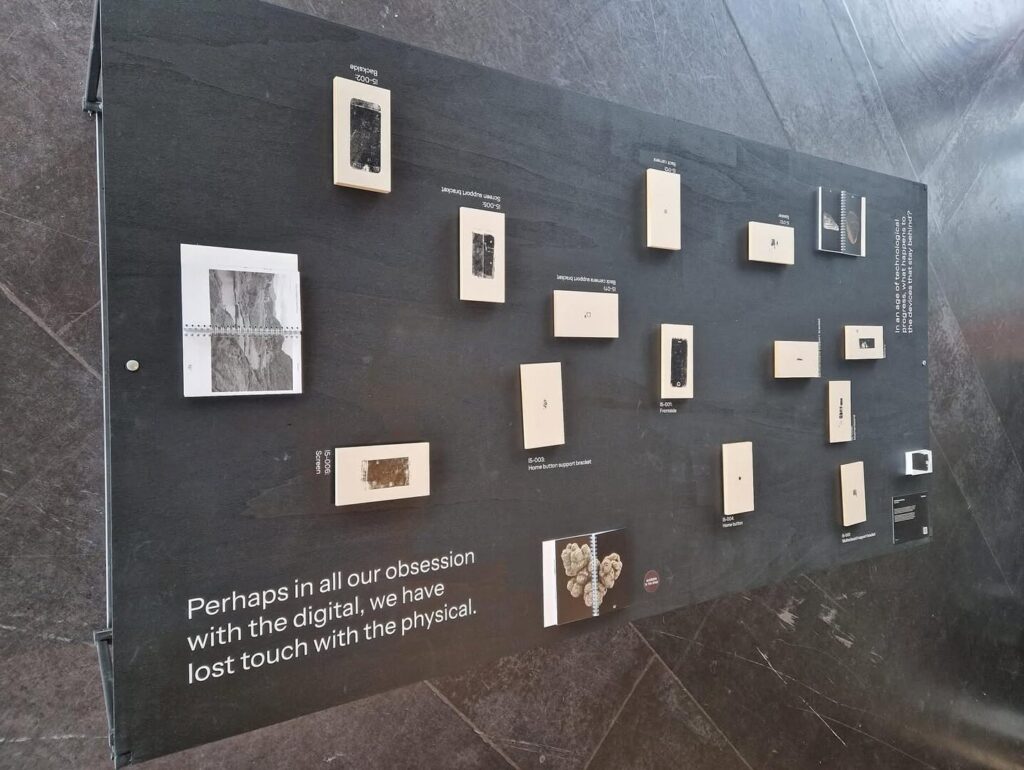
Nils Dijkstra is a graphic designer who has recently finished his bachelor’s degree at the HKU University of Arts with the work 21st Century Archaeology. Through the iPhone, this book explores the physical aspect of our digital age; behind the clean design of our smartphones and the magical online world they present to us, hides a mess of components and metals. What happens when you dissect the iPhone to make this almost invisible materiality visible and tangible?
Dijkstra’s work arises from fascination. His books take you along in these fascinations and gradually reveal, by presenting patterns and dissecting iconography, what exactly is so interesting about them. It doesn’t need to be explained, you just have to be open to it.
This interview has been edited for length and clarity.
The first work of yours that I saw was 21st Century Archaeology. Could you tell a bit more about that?
Yes, I’ve brought it with me.
Cool!
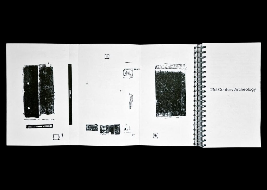
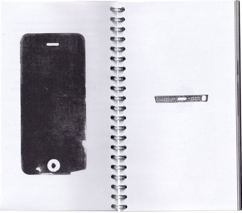
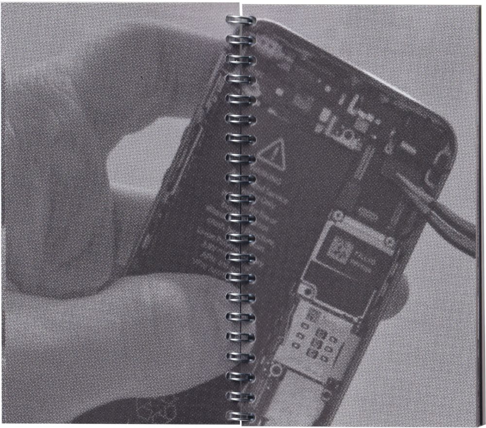
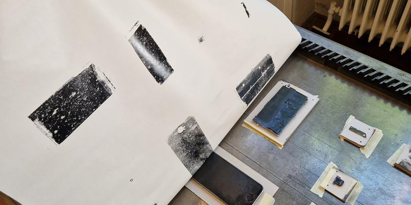
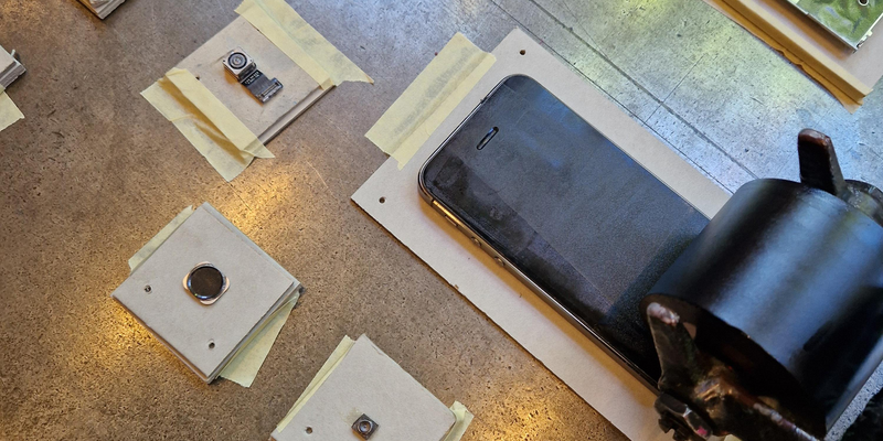
It’s kind of a dissection of the iPhone. But not as a digital object, but really as a physical object. In the first chapter, I completely take apart the iPhone and print all the components. I want to explore what actually happens with such a device when it’s no longer being used, when it’s become outdated, when it stays in a drawer. What could you still do with it? Might it still be useful for something?
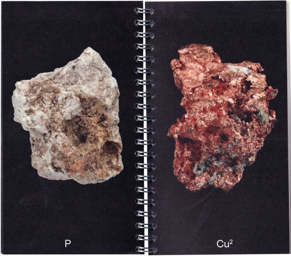
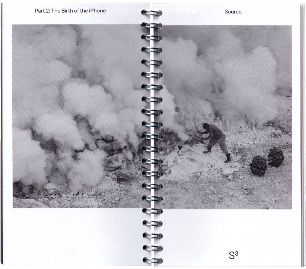
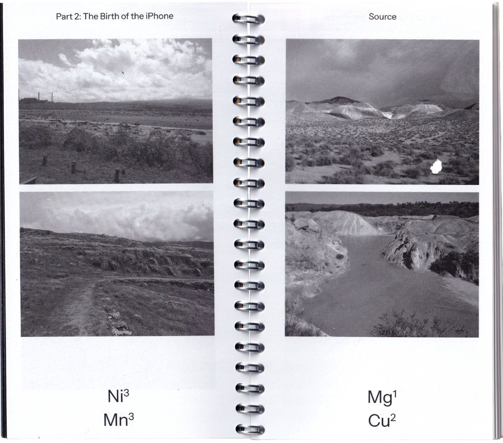
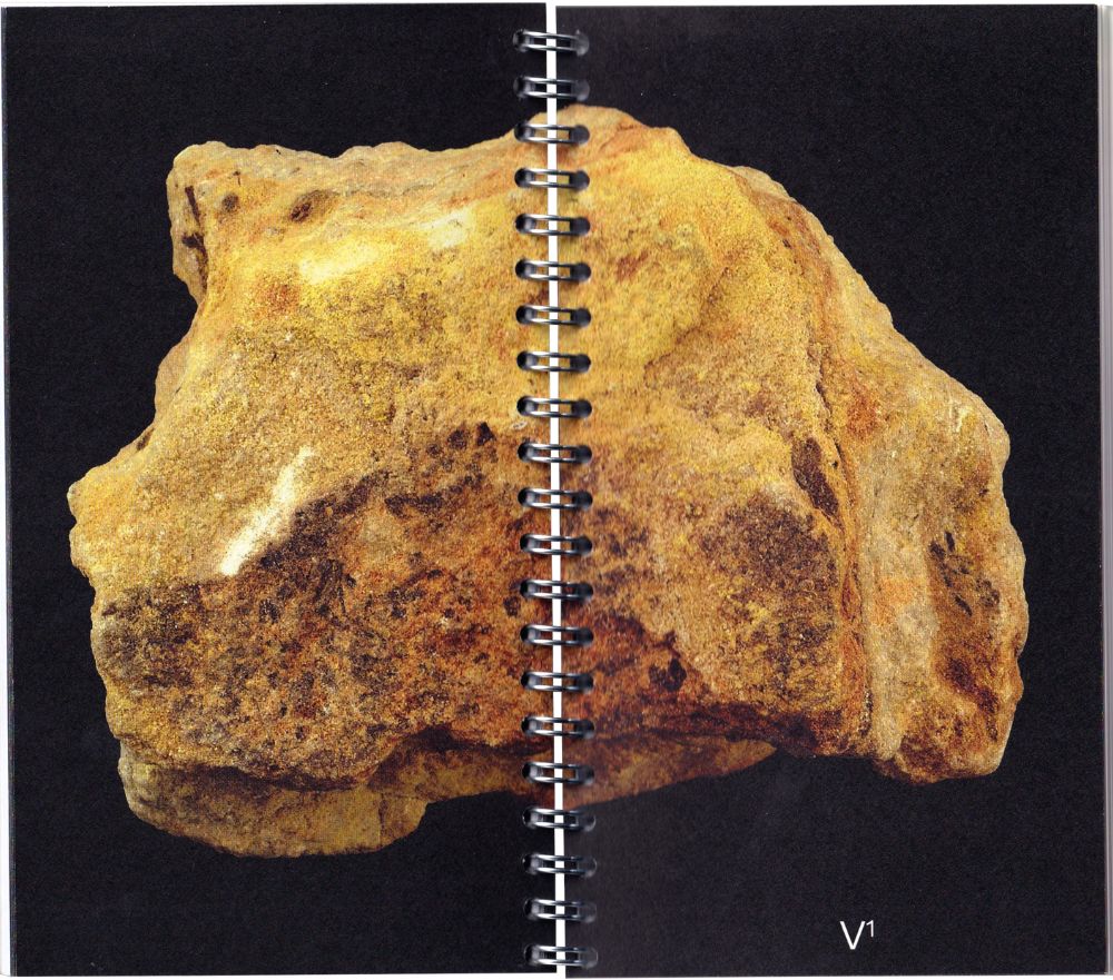
And the second chapter is really about the physical materials that are in it – so that’s mostly metals, a lot of them – and where they come from. So from mines. With everything, I explain what it is and what it’s used for. And in an essay, I explore the design philosophy behind the technology, mainly of Apple and therefore Steve Jobs.
What made you decide on this topic?
Such things come very naturally. In a book about Sweden, I saw all these red houses. I cut them out, and turned it into a little book. Then people started asking me about these houses. Where does it come from? I started researching it, and it turned out they use byproducts from copper mines for the paint. Then I did more research into mines and other materials, and that led me to these materials and these places.
I did not expect that that’s what brought you there.
Yeah, me neither. I hadn’t thought about doing anything like that.
Once you’ve decided on a subject, how do you get to the end product? What does that developing process look like?
I started with making prints. Also of other things, like laptops and computers. I also started printing on those with rust. I’d actually thought of this whole technique to use chemicals to let metal rust, and if you then apply a certain varnish to it, you get a kind of rust print. I also tried cyanotype on metals.
At first, it was about all that technology and the materials within, but then I considered that maybe it should just be one object. And which is the most iconic? For me, that’s the iPhone.
The prints that you’ve made really made me think of old, historical documents. And I found it very interesting how you present a very modern object as if it’s something really old.
Yes, hence the title. It’s a form of archaeology: I’m dissecting it like it’s an artifact.
It also really reminded me of a work in which someone had tried to map AI; so the technological aspect, but also where all the materials come from, how those are transported around the globe etc. And that turned into an enormous presentation of what’s inside such an abstract thing.
That’s also something I touch upon in my essay. Someone said that the design is a type of anesthetic, so it can really numb what something actually is. It’s a modern way of designing that’s also popular in architecture: as clean as possible, with as few buttons as possible. That way, you distance the user from what’s in it and where it comes from. That’s what I wanted to show.
Have you noticed it influencing the way you look at technology, or the way you use it?
It’s really only what I tried to tell in the first chapter. On Instagram, I asked if people had some old phones lying around, and I got so many. Someone gave me six old phones that were just lying in a drawer. Even though you… it’s very easy to recycle, instead of digging all those new holes to get these materials. I now think about that a lot.
I also have a lot of old phones at home. But a part of me feels like there’s all this important stuff on it, so I can’t just give them away.
Yeah, and it’s pretty weird that it’s an old, broken object and still… still people give so much value to it.
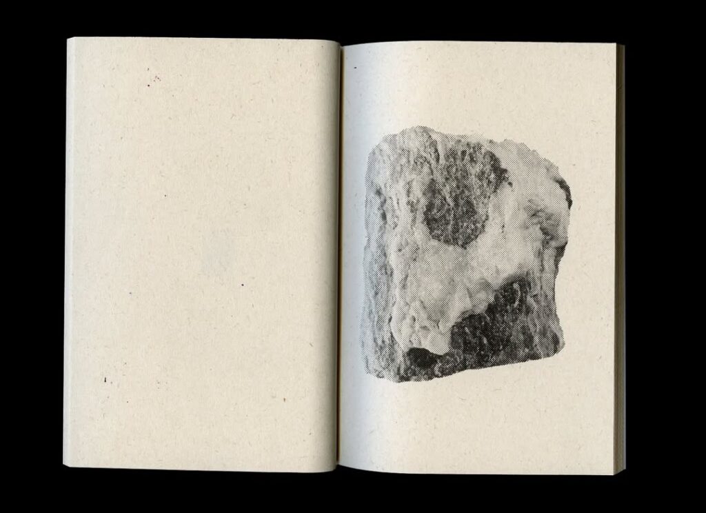
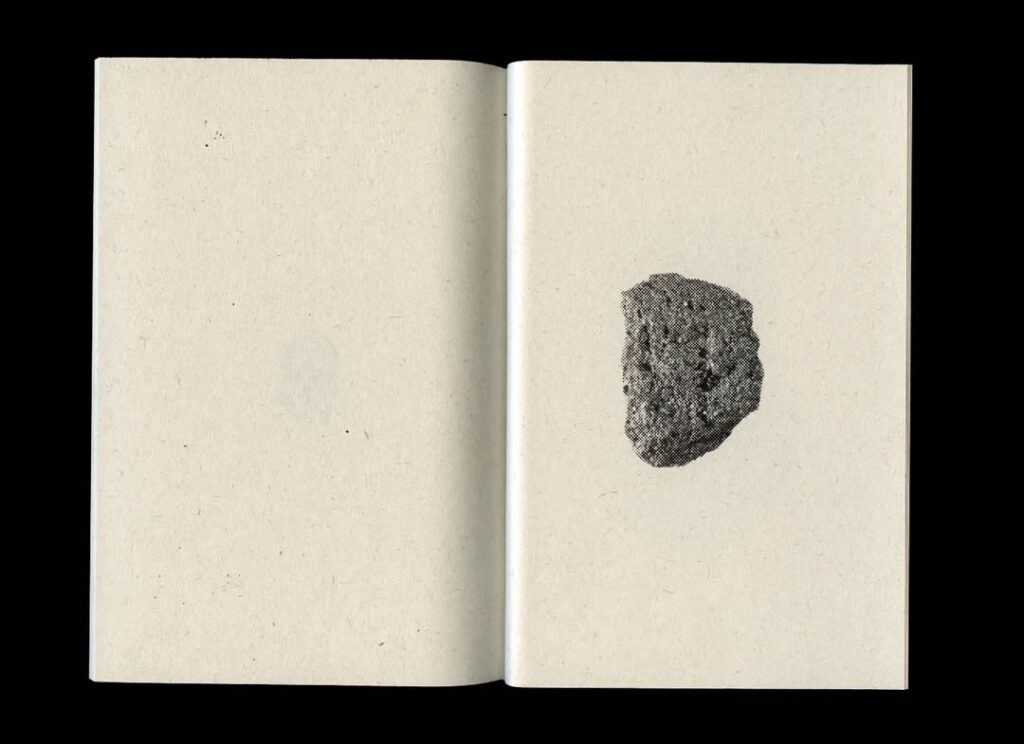
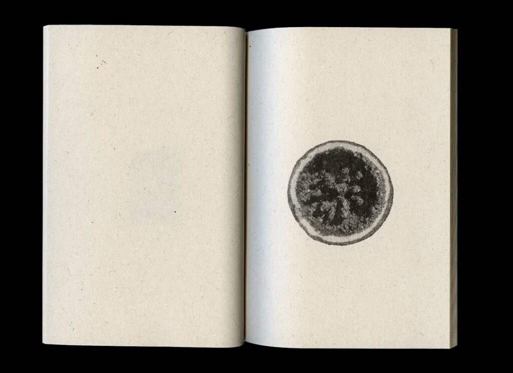
You’ve made a project before that came from your love of collecting stones and minerals.
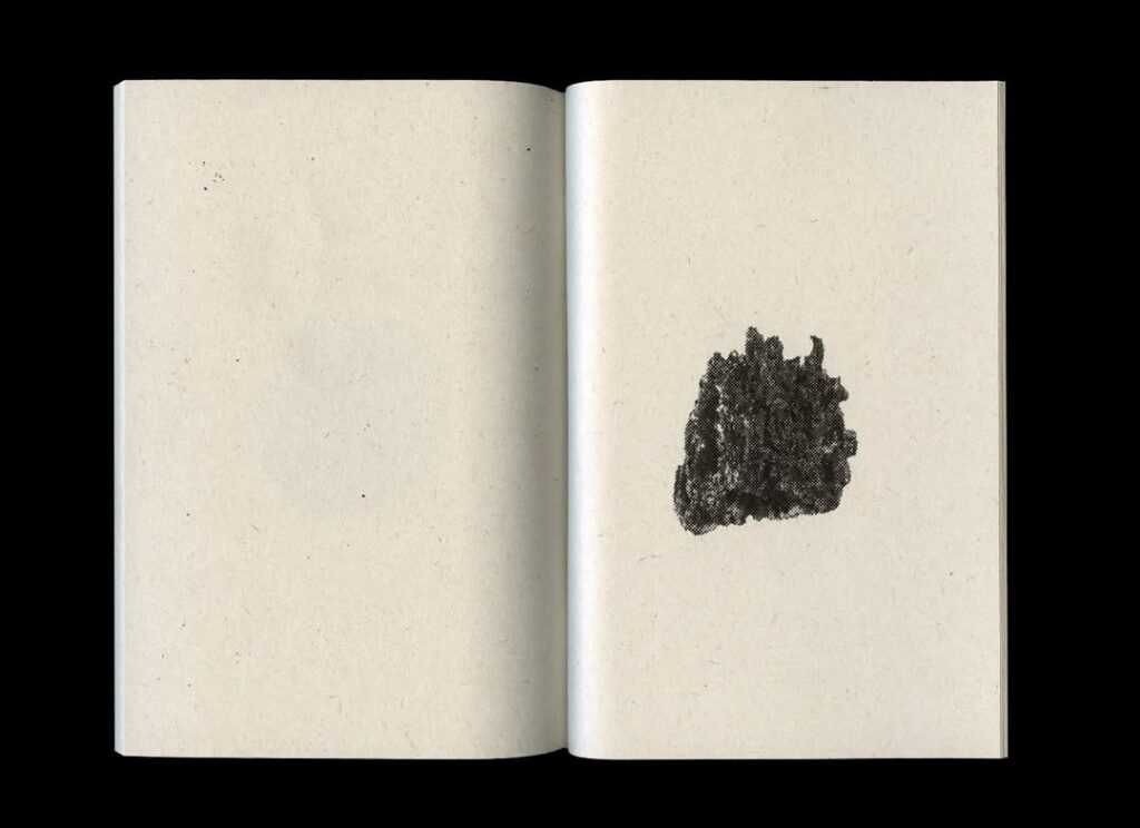
I’ve brought that one with me too! Those are riso prints. I don’t know if you’re familiar.
No?
Yeah, so a riso printer, it prints in only one color. In this case black. And that’s why you see all those dots, when you look closely. ‘Cause it can’t print gray, so if you want gray, you sort of need to add less dots.
But yeah, this is also – I like collecting. That’s kind of a theme in my work. Collecting and then hoping others find it interesting as well.
Did this also help give you an idea of how to visually approach ores, materials, metals for 21st Century Archaeology? Or was it a completely new process?
Well, it was actually – I hadn’t thought of it like that – a similar sort of approach. I hadn’t made that connection that quickly. Maybe others did, I’m now a bit of a ‘stone man’ for some people.
You mentioned that you like collecting things, and on your website it also says that your work comes from personal, almost obsessive fascinations. It might be hard to give a concrete answer, but where do these fascinations come from?
You’re right, that’s quite hard to say.
Are you actively looking?
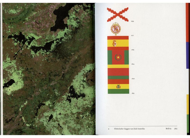
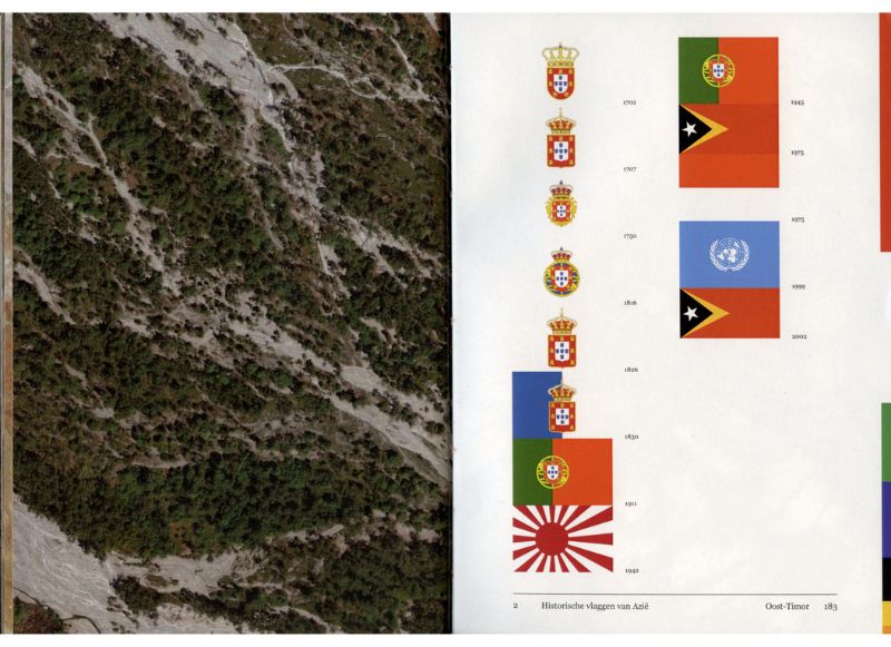
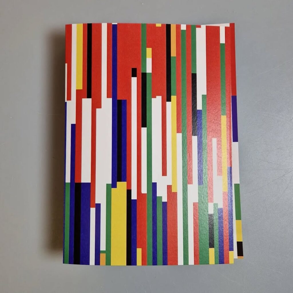
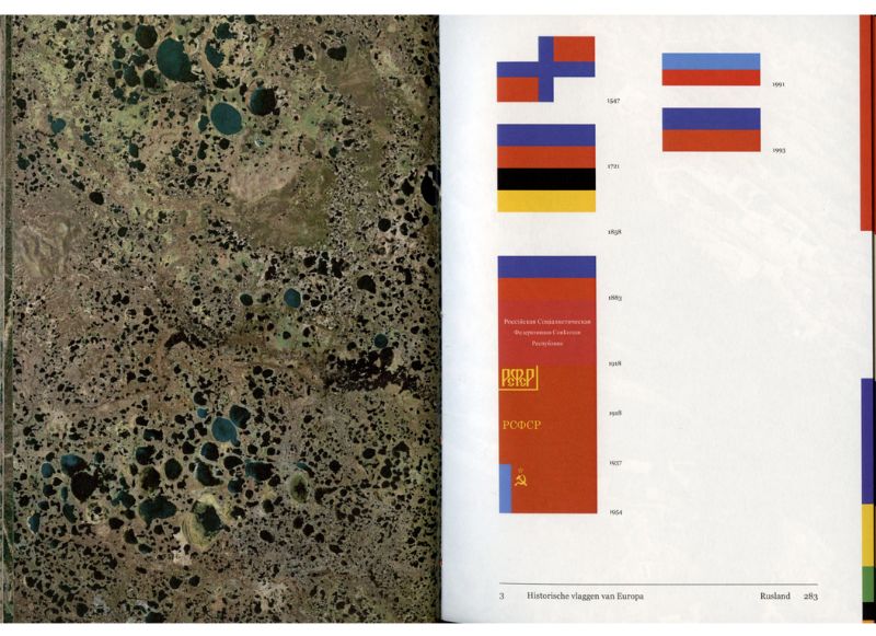
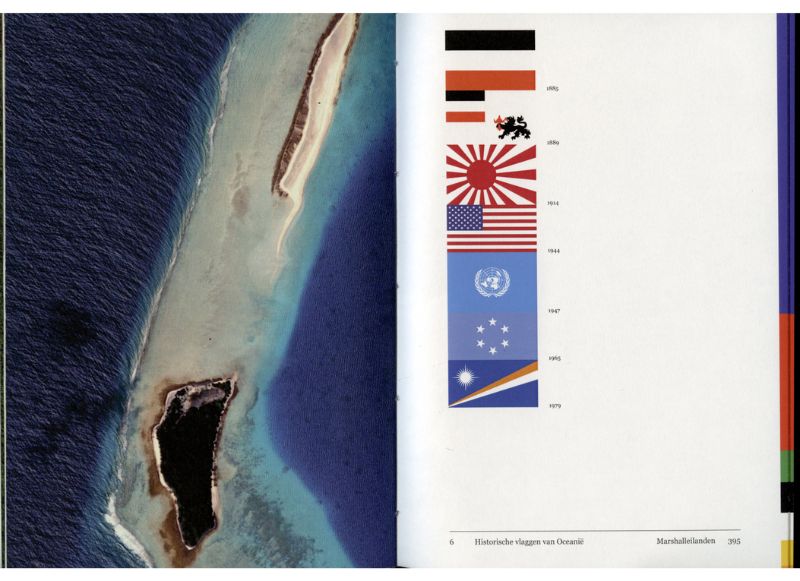
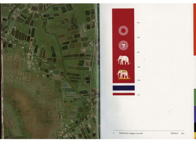
I’m not. For example, I made a book about flags, Red, White, Blue. It’s also like that; I will go and learn all the flags in the world. I know them all. Show me a flag and I’ll recognize it. So I’ll start collecting all of that and mapping it with a bit of history. And then a story will emerge naturally, because you’ll start recognizing patterns – like seeing the French flag a lot. I think that’s the first book in which I really explored such a fascination.
But yeah, I can’t really say where it comes from. It will suddenly come to me and then I’ll start delving into it.
There wasn’t anything that actively prompted you to start recognizing flags?
No, and me learning those flags, that was before I decided to make a book about it.
Another one of your books, How to be Erased, has a premise that could become a bit of a fascination for me.
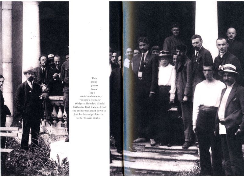
That came from a documentary series I saw on Netflix, called How to be a Tyrant. It’s a six-part series in which every episode discusses a dictator from a certain angle. And I think it was the episode about Joseph Stalin that discussed that you can just erase people from pictures or archives. And I found that so fascinating.
So that’s also something I collected. Although it was pretty hard to find a lot of material about that.
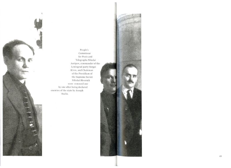
Yeah, cause how do you find people that have been erased?
You just google articles, and that leads to more articles. It’s often the same examples, but sometimes you’ll discover something new. And then you have to work out how to present it. So first, you see the new photo that was shown to the world. You’ll think: that’s a normal picture. And then you what was deleted. Some really are very bizarre, just how many people get erased. Every chapter starts with a new dictator, who in turn has been censored.
You might recognize a pattern in the covers, by the way. I’m not that good at making covers. At first I thought: I’m just going to throw some pattern on everything, and it won’t need a title. I struggle with titles.
Which part do you struggle with?
It turns out that text is kinda… I mean, I did go to school for this, but it’s pretty hard to make text look nice on a cover. And I like the idea of using visuals to draw someone’s interest, and then immediately have the title on the first page. But I don’t think you need to have a title on a book.
And thinking of the titles in itself?
That’s also pretty hard. I once received a tip that you could use your source of inspiration as a title. So I got How to be Erased from How to be a Tyrant. But nobody really teaches you how to think of titles.
Is it the idea that it has to be something all encapsulating? Or something that really captures it?
And it has to sound good too. Mainly that. It has to be logical as well. I first thought of ‘Digital Archaeology’ for 21st Century Archaeology, but that sounded like I would explore the digital aspect, while it’s actually about the physical object that you analyse like an archaeologist.
And you just said that you often don’t like text on covers.
Yes. Some people can do it.
I do find that remarkable, because on your website you do mention the typefaces you use for your projects. Do you have a specific approach for that? Or is it instinctual?
It’s mostly instincts. Usually I already have a few favorites, but actually I’m just looking around on the Adobe website. They all look alike, so then it’s about small stuff. Like a ‘t’ with a very subtle slant. So that’s it: very subtle details that I like. And it should fit. A serif font wouldn’t be right for something very modern, although you could use it as a contradiction. I do like sans-serif in general.
And mentioning the typefaces, that’s also to do with a fascination for collecting. I just want all the information, because I also like seeing what type of paper and what font is used when I buy a book.
I would’ve never considered that.
You don’t have that when you buy a book? I don’t know what types of books you like, but I always scroll to the colophon.
I’ve honestly never done that. When you’re looking at typography like that, do you also become very aware of fonts and design choices around you? Like, I immediately spot spelling mistakes when looking at a menu.
Oh yeah. Cooper Black is used a lot. That’s a thick, round typeface, appears very friendly, that’s why so many people use it. And like you say about menus: I immediately look at all types of technical, typographical errors such as incorrect hyphenation.
A lot of people also like it when text is in a block with justified alignment. I’ve done that too, but you really know how to design well and how it works. A lot of people don’t, but try it anyway, and you end up with massive holes.
I do recognize that.
It’s things like that. I notice it a lot. So yeah, you become very aware of it.
Are you able to switch it off every now and then?
No, not really. Also when I’m booking something on a website, I’ll often think ‘why would you design it like this on a web page?’ You have even less control on a website. Like, they’ll do the justified alignment, but when you tilt your screen everything goes wrong. I just don’t get it.
Back to your projects; an overarching theme I noticed is the idea of hidden traces, having all these ways of spotting a history that’s not immediately visible. Is that something you recognize or thought about?
I do recognize that. By collecting things and recording them, I try to lay out these patterns for people. And often I won’t really say anything about it. Especially in Red, White, Blue I don’t actually say anything. You just have to go through it, then the patterns will reveal themselves.
So I do recognize that I try to uncover such things, without saying too much about it myself. I’ve been told that sometimes, I could present a bit more of my own point of view. Maybe that’ll come eventually.
Was that already something you did before you started working with design and printing?
No. The fascinations, I’ve always had those. But I wasn’t laying them out to people. That’s only since I started art school.

You say you don’t always give a clear opinion, but your work does often carry a historical or political meaning. It speaks of dictatorship and authoritarianism, for example, or how technology is or isn’t degrading and the impact on our planet. Are you consciously looking for such political themes?
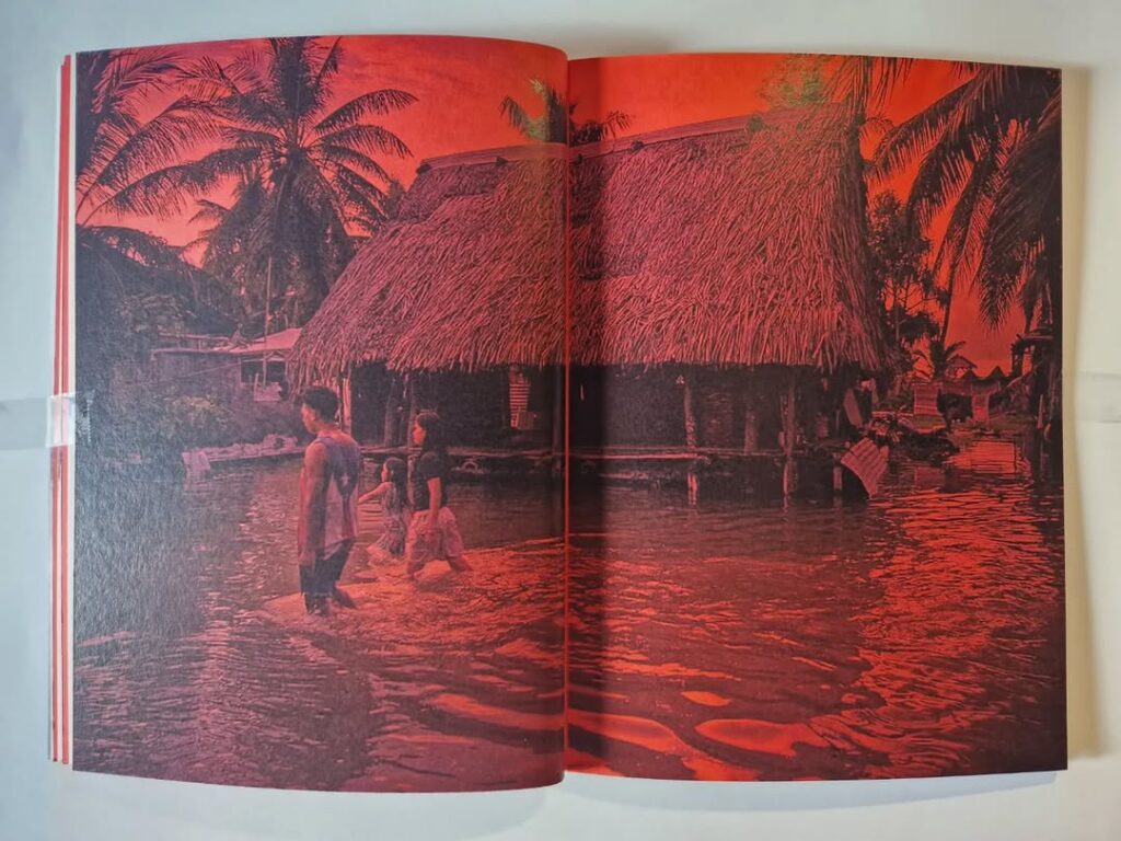
No, quite the opposite. It just happens. I always say beforehand that I don’t want that. I’ve also always said I’d rather not do something about the climate, because it very quickly becomes a bit cliché. If it’s done in an interesting way, that’s fine. I also made a book about Tuvalu, which has been calculated to become the first country to completely sink because of climate change. To me, that’s a more interesting angle for climate change, instead of it becoming a sad polar bear on an ice floe story.
So I’m not looking for it, but it does happen to me. I don’t mind, but I do try not to give my opinion too much and leave that to the reader.
How did you decide on joining art school?
Oh wow…
I’ve always been creative, starting with drawing in elementary school. And I remember that at some point my dad had this program on his computer, a kind of Illustrator but free. He was using it to create his own logo, and then I started doing that too. Very ugly, just making logos for things, but I enjoyed it. So I started looking for a degree that fit.
I didn’t immediately have all the material to be accepted, because I just wasn’t in that world yet. So I did two preparatory courses and learned all these techniques: screen printing, lithography, etching, things like that. Then you’ll quickly have a wide range of material, and I feel like I got accepted pretty easily by then.
But you didn’t join art school thinking you’d do something with book printing.
No, that really came in my first year. We got an assignment to make a book about a collection of something, and that’s when I made my first book. I’ve liked books and I’ve wanted to make them ever since.
Do you have inspirations when designing your books? Certain designers?
I collect a lot of books. Sometimes I’ll buy them purely because I want them, not even really to read them. I can really put that off. But take for instance Jeremy Jansen, he really has a similar way of working: also a lot of collecting. Always very sleek, very clean as well. Also Joost Grootens, he’s more in cartography. So he’ll use a lot of maps and data. Books about the world, things like that. And what else? Yeah, Hans Gremmen. It’s in a similar vein as Jeremy Jansen. A lot of photo books, but very cleanly done, with very big collections.
At one point, Jeremy Jansen made this book of a photographer who photographed everything in his parents’ house. And he put all those photos together, room by room, in this enormous book. I love stuff like that.
Do you currently have any ideas or fascinations you’d still like to do something with?
I’ll write stuff down sometimes. Recently I wrote down, similar to the flags, that it might be cool to map all the languages in the world. Their alphabet included. I think that would be nice, but also very difficult. It might be somewhat impossible, because not everything is recorded. But it might be a challenge.
With the flags, you’ll get this very clear pattern, of colonial powers for example. Do you already have an idea of the patterns you could find with languages?
I actually never consider that beforehand. Yeah, maybe it’s kind of mapping for people how different it all is, and it’s not just all the Latin alphabet for example. But I haven’t thought about it that much yet.
And are there any fascinations that you don’t need to do something with, but that do linger in your head?
This might be in line with languages: I’ve learned Norwegian this past year, a little bit. So I can speak some Norwegian. That’s another one of these fascinations, because I like the language and I think it’s a beautiful country. So maybe as an extension I could dig into Norse mythology. Or something with its nature.
You’ve now finished your bachelor’s, what’s next?
I currently work in bookbinding, at ProBook, and Libertas Pascal, that’s the press. We’re in a little attic at the bindery. I’ll stay there for a little while, also because I’ve found that I struggle with designing things on my laptop five days a week. So I’ve really spent the last year trying to make prints and looking for handiwork. And so I really hope to do more of that, maybe at a graphic workshop. And then figure out what else I can with my design career.
More Nils Dijkstra: